Lessons learned from giving the iOS app a major UX makeover
If you work with PDF and have an iPhone, you may have found a match ?
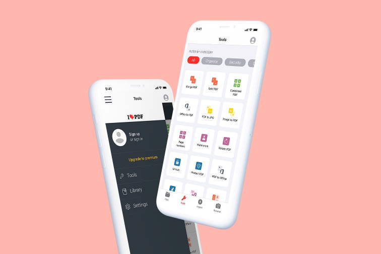
iLovePDF launched a major iOS app design update and we have to say, we’re really enjoying the new look and feel.
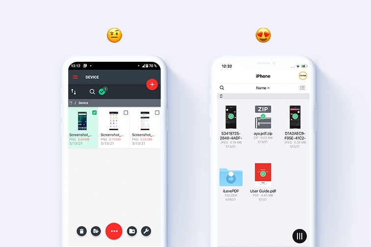
The release of iOS 12 included a silky smooth transition to using the iOS design guide. That meant a switch to lighter colors, improved navigation, as well a new dark mode for greater visual comfort when editing your documents on the move (see for yourself below).
You can download the latest version of iLovePDF’s mobile app via the App Store, available for iOS 11 and iOS 12.
Why did we redesign the iOS app?
The radical changes we made to the mobile application were after jumping into the shoes of our iOS users some months back and having a meticulous tap around.
We discovered that the user journey was sometimes confusing. The colors and lighting also needed refreshing. Also in general, the UX wasn’t always iOS-friendly and needed updating.
So we set out to create a more intuitive, simpler design, while reinforcing the fact that it is an iOS app. After all, if our users want iOS, we should give them what it says on the tin, right?
That’s when everything went a bit Apple-shaped
To solve the issues, we decided to make our app interface closely resemble the user experience of Apple’s iOS operating system. Following Apple’s iOS design principles, here are the 5 main issues we found, how we solved them, and what we learned about the iOS user in the process:
Problems, solutions, and lessons learned
Problem 1: The hamburger menu was very stuffed ?
The first problem was that you used to have to access the different app screens from the hamburger menu in the upper left corner. This meant that key elements such as your account information and settings were inconveniently hidden from view.
Navigating through the app started to become a bit of a jumble. It was time for a tidy-up.
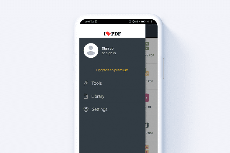
Solution: Tab bar for more intuitive navigation
To solve the hamburger stuffing, we decided to pull out all the productivity actions accessed via the hamburger menu and concentrate them in the tab bar located at the bottom of the screen.
This bar now gives quick access to all the main document task actions: Files, Tools, Import, and Scanner. This is far more convenient for the user because it helps them complete their document actions easily. ⬇️
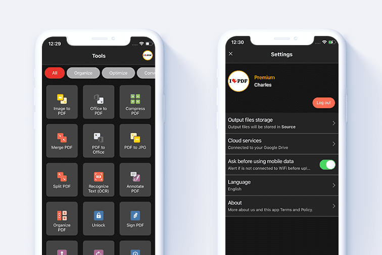
Then, as there were already 4 options in the tab bar, to avoid overcrowding we decided to concentrate the app settings including the user account configuration in the avatar icon at the top-right corner of the screen:
Lesson: We’re not a game of hide ‘n seek
We’re a Productivity app. Plus, according to Apple, “The best apps find the correct balance between enabling users and avoiding unwanted outcomes”.
This is what we realized when deciding where to place our app contents. Having essential ones hidden behind icons used to make completing actions less fluid for the user. Putting the right information on display, and at finger reach provided a more ergonomic and intuitive user experience.
Problem 2: The colors and lighting were a bit...meh
In general, we’ve always been quite happy with the aesthetics of the iOS app, because we’ve been working on it for a long time now. However, there is always room for improvement, and what better iOS UI design reference to use than Apple themselves?
The Apple design experts say, “A crisp, beautiful interface helps people understand and interact with content while never competing with it”.
With this in mind, we noticed that in some places, dark colors were indeed predominating the interface, without it actually being a dark mode. In others, the colors could definitely do with a touch-up.
Solution: Keep things crispy fresh
After the entire color relationship of the application was reviewed, we decided to opt for less dark grays and more for white spaces and light colors. We’re pretty pleased with the result:
Lesson: Less is more
We learned that the use of white spaces as well as different levels of transparency made a huge aesthetic difference to the app interface, resulting in a more enjoyable UX.
Not only that, but giving the app a clean and airy feel really does help you focus on the essential elements, such as a tool icon, or a download button.
Problem 3: There was no Dark Mode
It’s true that during the process of making everything lighter, we couldn’t help but begin to think something big and obvious was missing in the development. We started to worry that the users who liked the appearance of darker backgrounds might miss working with them.
The iLovePDF team gathered together and debated:
? What if we had a darker display setting to contrast with the Light design?
What if the other version could provide users with an alternative color palette for visualizing and working with PDF documents, in low-light conditions?
A portable PDF Editor for night owls?
Returning to Apple for reference, our Newton moment had arrived: It was time to create a Dark Mode.
Solution: Introducing the iLovePDF Dark Mode
Changing the app colors facilitated the incorporation of a Dark Mode because it functioned as an agreeable contrast version of the Light design. The new iLovePDF Dark mode provides you with an extra readability option for editing and organizing your PDFs.
It could save you eye strain the next time you’re e-signing and sending off a last-minute assignment in your PJs when the lights are out. It may also help conserve your smartphone’s battery.
Anyway, it looks really slick:
Lesson: Cater for all your users
During the app’s design refresh, we understood it was really important that we suited (and continued to suit) the needs of all our users. So introducing the iLovePDF’s Dark Mode was the perfect solution.
Apple puts a lot of emphasis on the value of adopting a Dark Mode because it's a system-wide appearance choice for many iOS users.
Problem 4: Buttons didn’t appear to be buttons
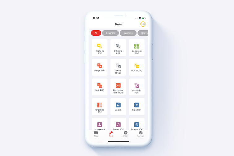
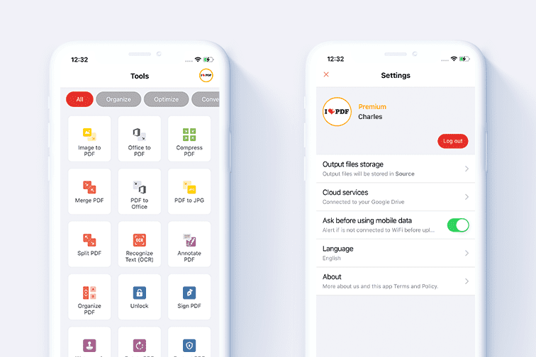
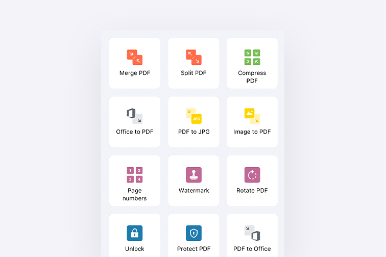
The fourth issue that we found was on the home screen. This is where you will find all of the tools you need to convert, compress, merge, split PDF files - and more - in just a few taps.
Taps on what, though? That’s when we had to admit, the buttons for each tool looked like little flat squares in a grid, rather than tappable elements that you could easily interact with:
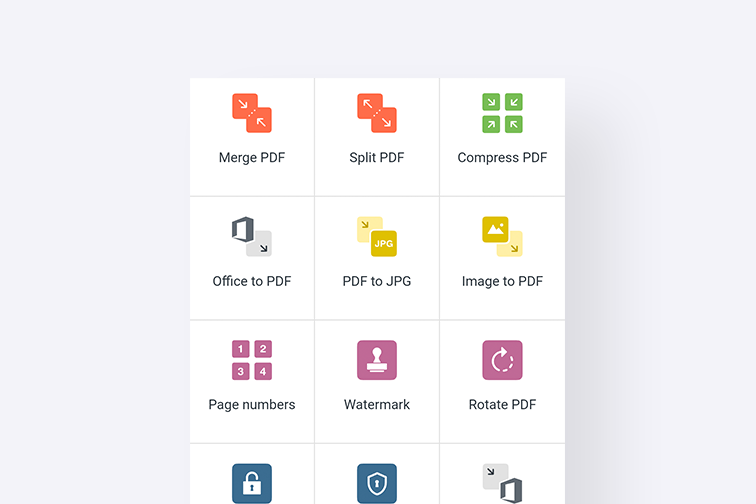
Solution: Use negative space and rounded edges
Apple’s user interface design guidelines mention that “if interactive and non-interactive elements have the same color, it’s hard for people to know where to tap.” We also knew that one of 2021’s top app design trends is the use of rounded shapes.
Taking both into consideration, we completely restyled the app home screen. First, we used grey negative space to create a more 3D effect. Then we rounded the edges of each tool button to reduce the flat grid feel.
Check it out!
Lesson: Clarity is key
We learned that just by tweaking colors and adding softness to edges, the use of the tool icons became much clearer to the user. In this way, the flat tool grid was completely transformed into an obvious set of tappable buttons designed for user interaction. ?
Problem 5: The font wasn’t very iOS-friendly
One of the pillars of a mobile application is the typography. Before, we used the same font which appears in our website. However, with all the other design changes we were making to the iOS app, the use of our website font in the mobile app seemed a bit outdated. Plus, it didn’t really fit with the new iOS style we were going for in the app.
Solution: San Francisco!
As we wanted to provide our users with a more iOS experience, we decided it was the right moment to adopt Apple’s San Francisco font. The main advantage of using their font type was that it was more optimized for mobile apps.

Lesson: Opt for optimization
We learned that just because something looks good in the web version doesn’t mean it’s necessarily the right thing for the mobile app. After all, they are two completely different applications.
If we wanted to keep our app as optimized as possible, it was necessary to change the typography. It was more coherent with Apple’s style guide, and as a result, gives us a more native appearance in the App Store.
Putting everything together
We applied these iOS design principles to our other screens, buttons, pop-up windows, and cards. In fact, now around 90% of iLovePDF’s app icons and interface elements belong to Apple's own style guide.
In doing so, we’ve managed to create a more attractive UI and pleasing UX that allows you to swiftly move between different app screens and work with our PDF tools seamlessly.
Conclusion: Adapt to today’s standards
Adopting Apple’s design principles has helped us to develop the mobile app that our users love today: A simple, all-in-one solution for all your PDF needs.
Providing users with all the options they need while maintaining simplicity and clarity can be a challenge, and we’ve learned a great deal along the way.
One piece of advice we’d give to any new app UX and UI designers? Avoid overcomplicating things: Use all the design resources available and accessible to you. They’re there for a reason!
So… what do you think?
We really hope you are enjoying the latest iOS app. We’ve got some exciting new design ideas in the pipeline so stay tuned for more updates. In the meantime, if you have any feedback on how we can improve, feel free to write us an app review.
Finally, if you haven’t already, you can download the app for free on the App Store for your iPhone or Tablet.
在我们这里是安全的
- 无论你使用的是哪种工具,我们都是采用端到端的加密,以便为你的文件提供最高防护,确保你的文件不被窃取或拦截。
- 任何上传至我们系统的文件都将在2小时后自动删除,以防止任何未经授权的第三方访问。
- 我们所有的服务器都受欧洲法律的保护,这是世界上最严格的法律之一。


